People are using their phones in more critical conditions than ever before. According to EarthWeb, the average smartphone user in the United States spends 5 hours each day on their device. Apps and websites account for the majority of that time. Personalized communication, a welcoming voice, and intuitive interaction are all important aspects of good mobile app designs.
You’re mistaken if you assume ingenuity and imagination are all you need to develop the optimal user experience, whether it’s for mobile, tablet, or the web.
Every app design, like anything else worth having, requires consideration. If you’ll pardon the expression, it serves a function.
Users can decide whether or not they’re interested in what you’re selling in as little as three seconds. And design, you got it, is the driving force behind that decision! 90% of app users said they stopped using a specific mobile phone app due to bad performance or design.
With smaller screens and even shorter attention spans, your UI design must be straightforward while also being familiar to users for simplicity of use.
When designing for mobile, there are numerous factors to consider. In this blog, I’ve included several valuable tips that you can use in your mobile app design.
Here are some best practices for onboarding that will significantly improve engagement and uptake
1. Use high-resolution images
The first step in improving your app’s aesthetic attractiveness is to include high-resolution photos and graphics. The scheme consists of rich, brilliant hues, crystal clear product photographs, and pleasant background imagery.
Both aesthetics and utility can work nicely together. It’s just a matter of striking the right balance. It would be best to use high-resolution photographs that don’t blur when zoomed in on the app.
At the same time, it’s worth noting that high-resolution photographs are typically large and slow to load, which might be a problem.
As a result, use high-quality images that are also lightweight and quick to load. This can be accomplished by resizing photos to fit the screen.
2. In-app search
One of the essential features of in-app design trends is in-app search, which is often underestimated. A significant number of people visit a mobile application searching for something specific, and the app must guide them to the correct result in the shortest time feasible.
- Place the search box in a visible and easy-to-find location. Allow users to search without having to hunt for it.
- Avoid landing on a page that says “no match found.” If at all possible, show the closest results.
- Use auto-complete to help users find what they’re looking for faster.
- Use high-quality search indexing to ensure that the most relevant search results are displayed first.
3. Pay attention to the location
Because many of the services provided by applications are location-based, it is a good idea to enable current location detection.
Detecting the user’s location and leading them to the desired destination is critical for food delivery, restaurant, bank, or store locator apps, and a variety of other comparable apps.
When a user requests instructions to a specific location, it is self-evident that you would utilize his present location as the starting point.
To get a map, the user shouldn’t have to enter his zip code or location. The user may not even be aware of his current location and relies on the app to assist him.
4. Pay attention to thumb-friendly zones
It is critical to consider one-hand navigation and thumb-friendly zones while doing design the process for a mobile phone. It’s almost universal to use the thumb to navigate.
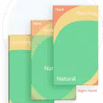
Source: moveoapps
With screens increasing bigger and thumbs becoming less useful, it’s more vital than ever to optimize your screen’s real estate for one-handed navigation.
Put the most important and often used icons and buttons in the thumb-friendly green zone. The less-used buttons should go in the yellow zone, and any controls in the red zone should be avoided.
If a user has to stretch his thumb or use the other hand only to click a small icon in the corner, he’ll be less likely to stick with the program for long.
5. Keep font clear and legible
It’s natural to want to play around with fonts and try new things. Users, on the other hand, prefer a native app with a clear, easy-to-read typeface. Keep your font size above 11 points, as anything less will strain the eyes of your readers.
Line spacing, paragraph breaks, and indentations should all be optimized appropriately so that the text across the app is uniform, cohesive, and easy to scan.
For simple reading, make sure there is lots of contrast between the typeface and the background. Light-colored fonts may appear pleasing, but they are challenging to read, especially when set against a light background.
The importance of good contrast in simple readability cannot be overstated. When mobile users are outside, and the light makes the screen appear dull, high contrast is also quite helpful.
6. Keep buttons in the right size
Tap buttons, as simple as they may appear, are an essential element of mobile app design. The lower screen size, as well as the use of the finger as the primary touch mechanism, must be taken into account.
Buttons that are overly small and close together are difficult to tap with the fingertip and are prone to errors. It can be aggravating if users keep tapping the neighboring button repeatedly.
When using a desktop and a mouse pointer to accomplish precise work, things are a little easier, but for fingers, err on the side of caution and create your buttons large enough and with adequate padding space.
A typical finger tap measures 14mm-15mm in length. As a result, when developing buttons, this is a solid rule to follow.
The padding area around a button prevents the neighboring button from being activated in the event of misplacement of the finger. Padding also makes your UI elements feel more spacious and organized rather than cluttered.
7. Make it easy to go back
It may come as a surprise to app creators, but some programs make taking a step back extremely difficult for mobile users. Users can return to the homepage by pressing the back button.
The back button does nothing at times, and there is no back button at all at other times.
In one click, good software lets a user go back and make changes, take a second look, or select another choice, and then proceed with ease.
It’s also vital to pay attention to where the back button is placed. This can be found on the top left of the screen in iOS apps, and the typical ‘Go Back’ button can be found in Android apps. Make sure the user doesn’t have to look for it.
8. Keep UI consistent with the website
If you’ve been dealing with people on a website and are now launching a mobile app, ensure the UI elements are consistent across the two platforms.
Users who are used to a specific UI may be confused if the app has an entirely different color palette or uses foreign language and terminology.
The appearance and feel of the movie and video selections page[PAGES?] on the Amazon website and app are comparable, allowing consumers to use either one as they like.
9. Reduce cognitive load by more graphics, and less text
A user’s cognitive load increases when there are too many alternatives to pick from, too many questions to answer, or too much information to read and comprehend.
Your app should not require a user to be educated to utilize it. Apps are used to make people’s life easier. When using the app, cognitive burden negates the goal.
Instead of telling users what they need to do next, your app should show them using detailed graphics what they need to do next.
The UI of a successful app should be simple enough for even a five-year-old to navigate. Reduce your users’ cognitive load by using a minimalist design that only provides the essential information.
Avoid using showy design systems and instead opt for gentle, subtle animation where necessary.
10. Minimize the need to type
Typing on a mobile device isn’t always easy, and it’s prone to errors. As a result, keeping the typing needs to a minimum is a good approach.
Keep forms simple by asking for only the most basic information and using auto-complete whenever possible. It’s also a good idea to match the query type to the keyboard.
When asking for a pin, show a numeric keyboard, use a search button instead of entering when searching, and include ‘@’ and ‘.com’ buttons when asking for email IDs.
Effective navigation
It’s time to get to work after the user has been successfully onboarded. A great user experience begins with excellent navigation. Every action or piece of data should be simple to communicate and carry out.

11. Make registration simple and frictionless
To create a personalized experience and maximize conversions, an app must entice the user to register. This is, however, a step that should be taken with caution.
- Allow users to sign up later or skip the registration process
- Input email from the google play store or app store automatically
- Request only the most basic authorizations
- When requesting personal information or permissions, provide context
- Instead of using general directions, use courteous, encouraging language
12. State your value proposition
Your software has just been downloaded, and users want it to fix a problem right now. This is where you explain what your app will do for them and how it will improve their lives.
This isn’t the moment to show off your app’s glitzy features. Instead, concentrate on the essential aspect.
Lookout, a mobile security app, provides one example. It has a clean and straightforward onboarding process.
The first screen that appears tells you exactly what this software will accomplish for you, and the following four screens show you how it will do so in four different ways.
App design hints: What to look out for during the development of an app
When it comes to developing your app, keep the following in mind:
Make it easy to navigate:
A successful app is nothing without simple navigation; therefore, build with this in mind to give your users a smooth and delightful experience.
Ensure that the user can see the navigation drawer or tab bar. If a user doesn’t know how to navigate your app, they won’t be able to do so, so make sure everything is visible and know where to go.
Keep in mind that your users should be able to browse your app intuitively if you pick a layout that they are acquainted with.
Another important consideration is that it should be finger-friendly. If the buttons and links are too small for people to click with their fingers, they will have a tough time navigating through your app.
Design for simplicity:
For a modern aesthetic, keep things simple and make liberal use of whitespace. This helps your users to concentrate on what is essential. Using familiar symbols as well as words can help keep things straightforward.
Designing for simplicity involves making the user experience as pleasant and straightforward as feasible.
Your user will become overwhelmed and exit the app if there is too much information displayed on the screen at once or just too much going on.
Think about visual hierarchy and weight:
The size and impact of certain on-screen items in comparison to others are referred to as visual weight. To make the most crucial components of your design stand out, use visual weight.
Make that the structure you establish for pages and sub-pages, as well as headlines and sub-headlines, is consistently constant.
Pick colors and fonts mindfully:
Color psychology has a significant impact, so don’t overlook it. Similarly, the fonts you choose will affect the look and feel of your native app.
Consider the hidden messages that these web design elements convey and choose them wisely. Remember that for a consistent and professional style, you don’t want to mix too many distinct colors and fonts.
If your company has brand guidelines that include specific colors and fonts, make sure to follow them in your app design so that it becomes a seamless extension of your company.
Be consistent:
The issue about colors, fonts, and other product design components is that they can only be effective and leave a favorable branding effect if you are consistent. This also applies to other graphics, navigation, and your content.
Visual consistency (design components such as colors, buttons, and labels), functional consistency (your app should perform consistently across all elements), and external consistency (your program should look and feel the same).
Consistency throughout your app will make you appear more professional, and it will help your consumers form a bond with your app and brand.
Helpful tools and resources for mobile app designers
If you’re looking for design inspiration, here are some of the top free design tools and resources:
Adobe XD

When it comes to design software titans’ design tools, Adobe Experience Design (XD) could be the first name that springs to mind.
Experience good app design, like other Adobe products, is a large piece of software that lacks almost all of the functionality you’ll need for your mobile app design.
XD has ample functionality for all of your mobile projects in terms of layout, prototyping, animation, and even collaboration.
The tool provides the quickest route from design to prototype mode.
With the ability to drag and rotate items in 3D space and add perspective to your work, the 3D transforms function is a terrific way to add realism to your creations.
Voice prototyping is one function that comes in helpful. In other words, you can include speech playback and voice-activated capabilities in your software.
UXPin

There’s scarcely a better alternative to consider than UXPin for app developers and mobile app designers trying to drive their projects using Agile UX without dabbling in a lot of coding.
The tool features a drag-and-drop UI design/UX design interface that generates high-fidelity mockups, prototypes, and wireframes, with an emphasis on the elimination of coding.
The broad built-in libraries ensure that you spend as little time as possible on your projects.
The libraries have you covered if you need resources for iOS, Bootstrap, Material Design, or even hundreds of icons.
It works well with Sketch, Google Fonts, and Slack, among other programs.
Further Reading: How To Develop Apps Like Airbnb And Slack?
OmniGraffle
The best wireframing tool may be your most pressing demand at the start of your mobile app development cycle. OmniGraffle is a strong diagramming program that we recommend for quickly as well as easily producing mobile wireframes.
It comes with a variety of templates, stencils, canvases, and grid guidelines, among other things, to make this feasible.
Even for non-tech-savvy novices, the drag-and-drop interface makes vector drawing simple. OmniGraffle, on the other hand, isn’t just for wireframing and vector graphics.
Color contrast checker
Many mobile apps fail the AA test, which is surprising. Make sure you’re not one of them! It’s critical to double-check your color contrast’s accessibility. To test color combinations, use WebAIM’s Color Contrast Checker.
Conclusion
Finally, good visual appeal and utility are combined in mobile application design. When these two parts are skillfully combined, the outcome should be a stunningly designed app.
Expecting a flawlessly developed app on the first try is unrealistic. Always keep in mind that it’s a never-ending process.
As you receive comments on your mobile app, it will continue to improve. The user experience will be perfected with more testing and learning from mistakes.
Do you want to create your mobile app? We have a fantastic team of mobile app designers and developers here at Markovate that are dedicated to making your app concept shine!